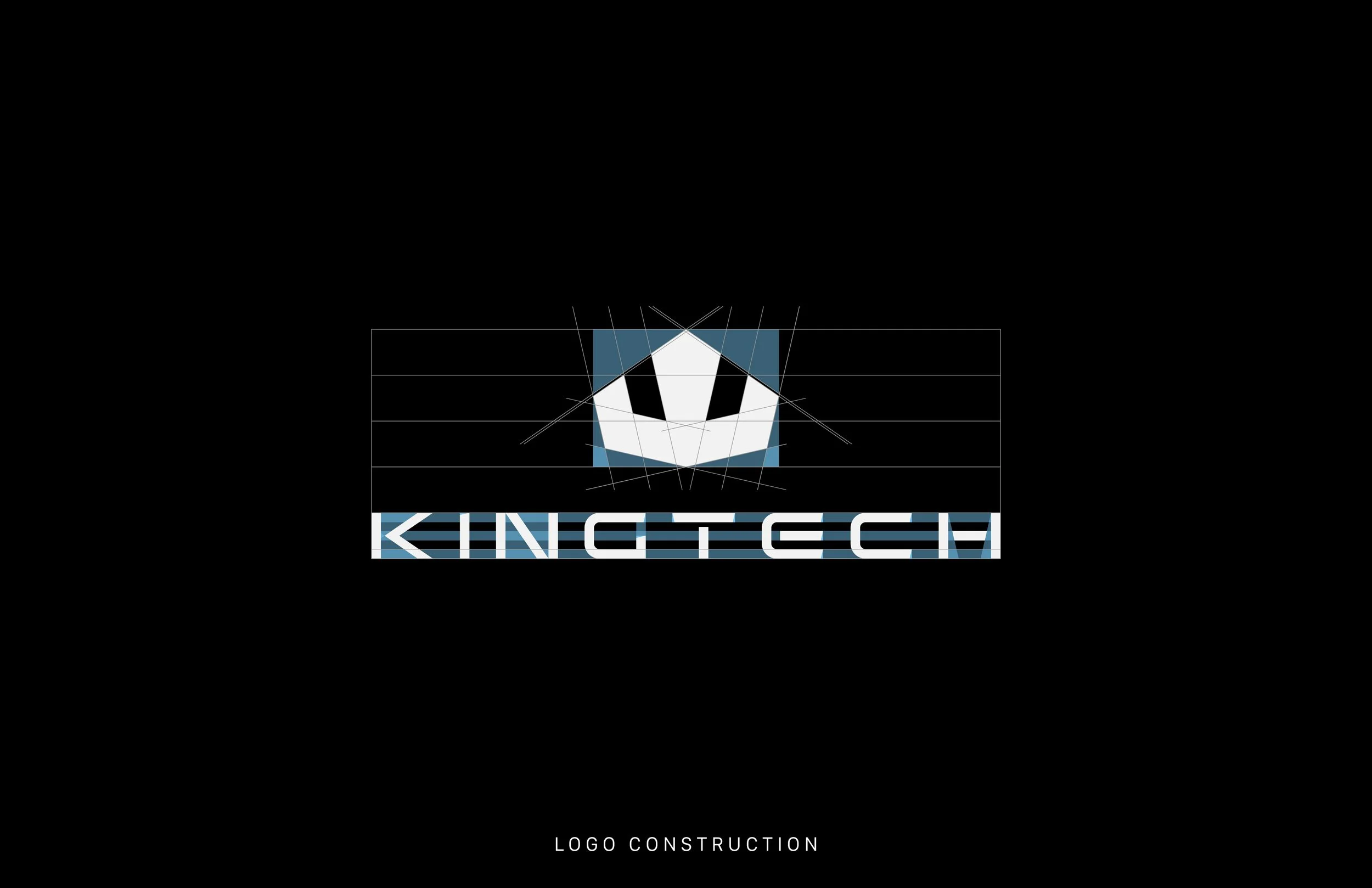
KINGTECH plays the role of an elite, enigmatic tech conglomerate in Blink Twice, and the brand identity was designed to mirror its cold power and glossy control. The logo’s modern, futuristic geometry and stark monochrome palette evoke precision, dominance, and mystery essential traits for a company operating behind closed doors, manipulating systems under the guise of innovation. The blood-red accents and polished steel textures nod to the film’s darker undertones, suggesting that beneath KINGTECH’s clean, tech-forward exterior lies something much more sinister. From the logomark's crown-like silhouette to the modular, militaristic typography, every detail reinforces KINGTECH’s duality: polished public persona versus covert corporate menace. The branding becomes a quiet character in the film always watching, always one step ahead


